Systems become useful when decisions become visible.
Three featured cases show how I measure, explain and govern complex systems. Two supporting workflow studies add breadth. The page carries public evidence; deeper product context is available during a live interview walkthrough.
01 / Design system and accessibility
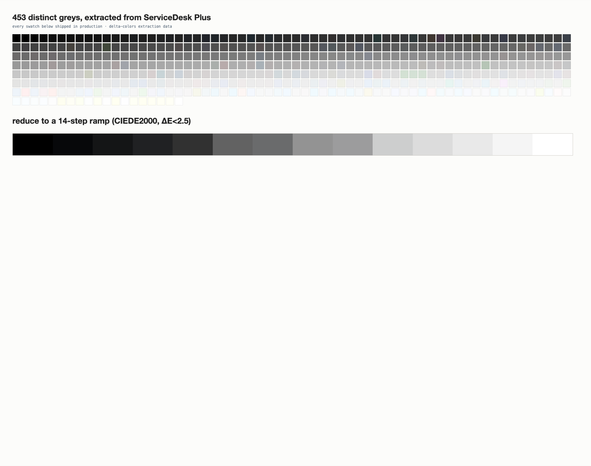
The 1,457 Colours
Turn a visual argument into something measurable.
Available to showcase during a live sessionOriginal project artefact. Select an image to inspect it at full size.
The problem
ServiceDesk Plus contained 1,457 colour values, including 453 greys. Near-duplicates made consistency difficult to inspect and govern.
What I did
I audited the values and built a CIEDE2000 comparison tool that suggested perceptually close replacements, listed unmatched colours and carried luminance into the specification.
What changed
At a ΔE threshold of 2.0, 254 colours remained unmatched; at 2.5, 10 remained. The final ramp was designed from the findings rather than copied from the working palette.
Actual audit: the extracted grey values.Actual tool output: unmatched-colour comparison.
The strongest evidence is the tool itself: it exposed close matches, exclusions and contrast information instead of hiding uncertainty.
02 / AI-assisted support
RAG-based Suggested Solutions
Help an agent inspect the sources behind an answer.
Available to showcase during a live sessionOriginal project artefact. Select an image to inspect it at full size.
The problem
A support answer can sound confident even when the evidence behind it is unclear. Agents need a way to assess the suggestion before using it.
What I did
I designed a request-form experience that paired a step-by-step answer with references to the retrieved solution records.
What changed
Source attribution became part of the answer rather than secondary decoration, and the no-answer state kept an unresolved action visible.
The archived design establishes the source-linked answer pattern. Backend architecture, release status and measured agent outcomes are not claimed here.
03 / AI-ready design system
MEDS
Design a system that both people and AI can inspect.
Available to showcase during a live sessionOriginal project artefact. Select an image to inspect it at full size.
The problem
AI-assisted design work needs reusable component guidance, but model judgement is unreliable for some precise checks.
What I did
I worked on component guidance, repeatable gates and a review layer that separates deterministic checks from judgement.
What changed
The system makes coverage and failures visible instead of presenting incomplete automation as certainty.
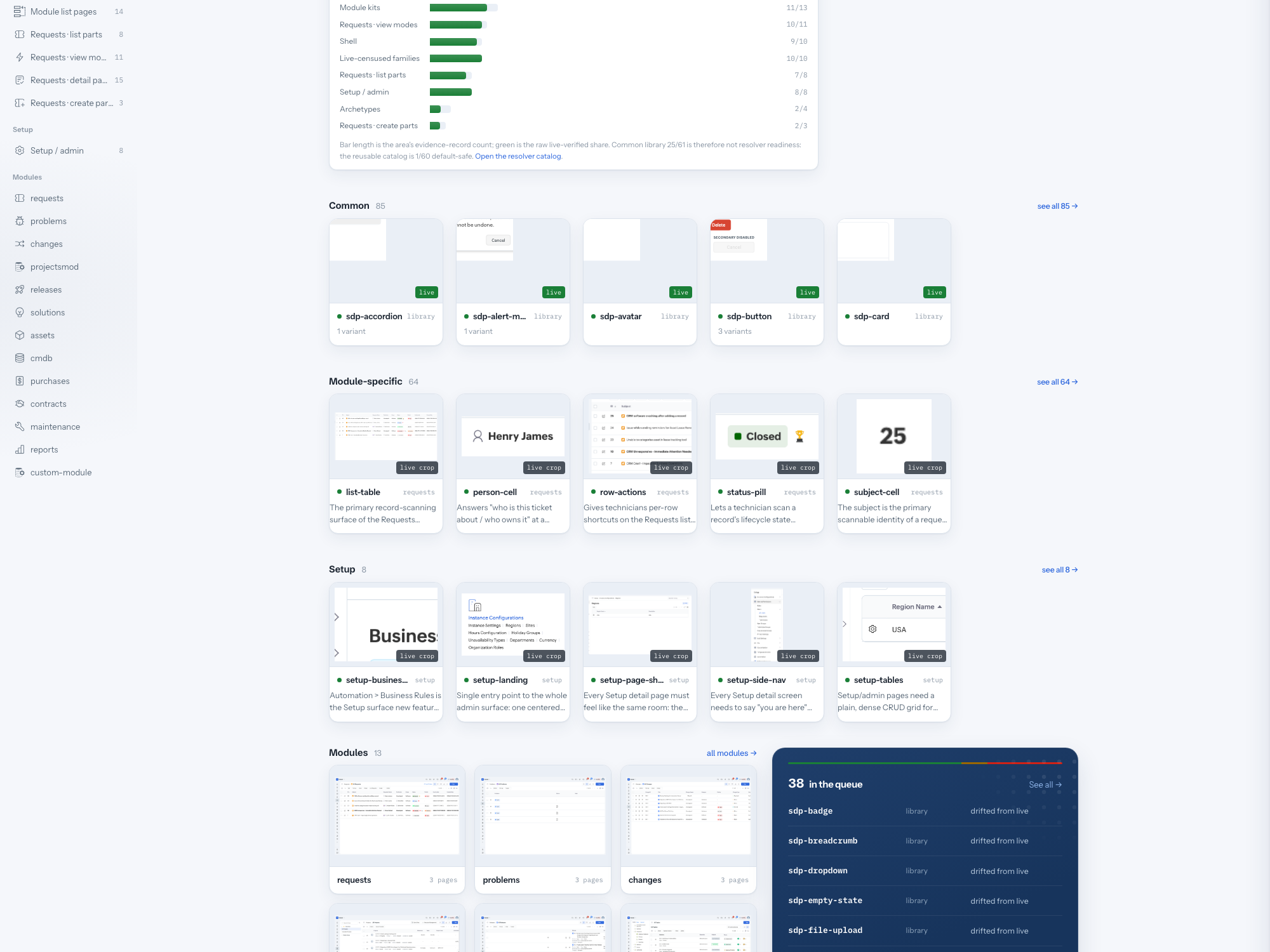
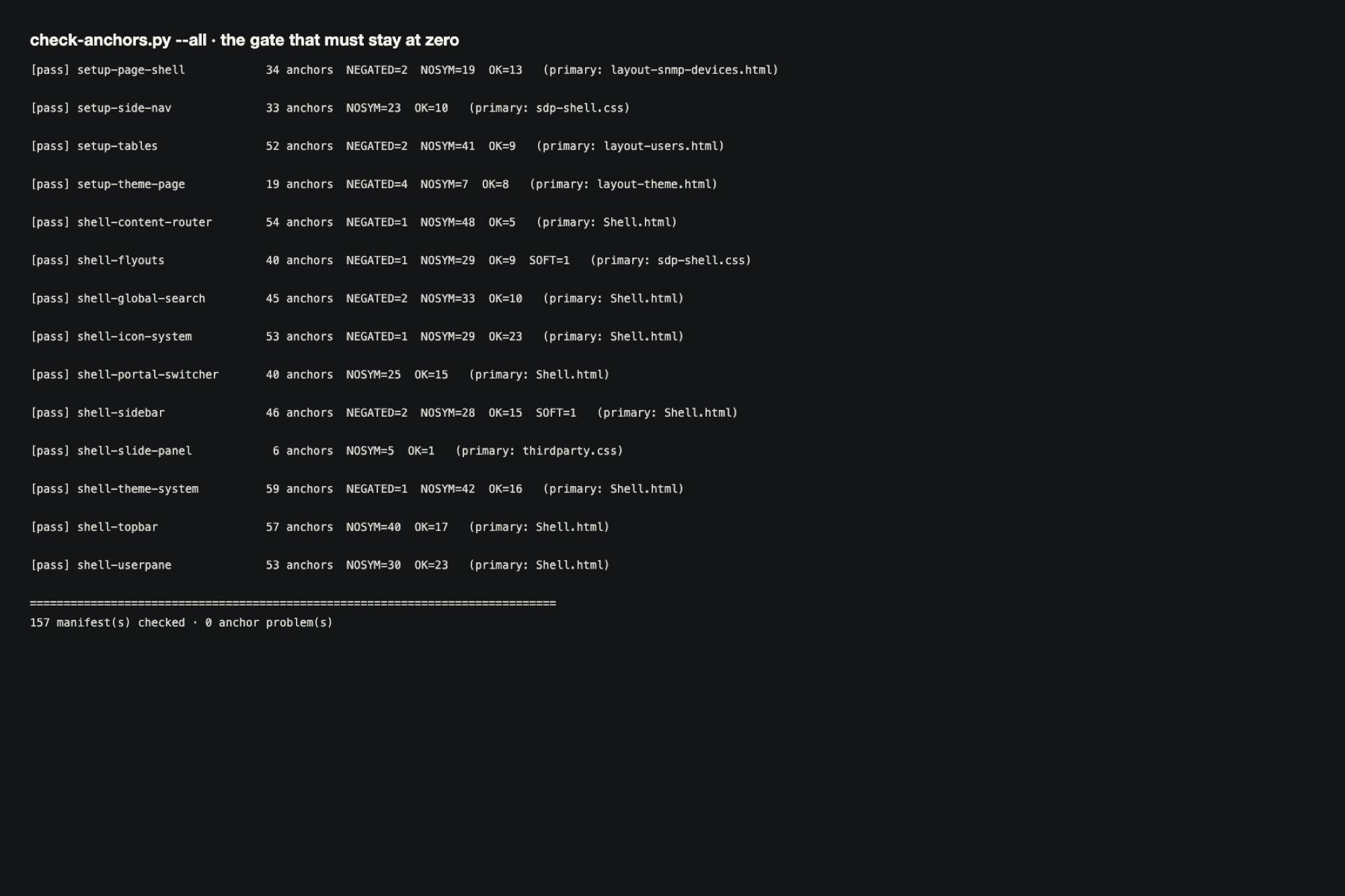
Actual evidence: component census and coverage view.Actual evidence: repeatable gate checks and visible gaps.
MEDS treats unresolved gaps as product information. Exact rules and model judgement have separate roles, with human review remaining explicit.
04 / Enterprise workflow
Asset Reservation
Make shared equipment easier to find and reserve.
Available to showcase during a live sessionOriginal project artefact. Select an image to inspect it at full size.
The problem
Booking equipment involves more than an asset list. People need a clear entry to the task and an understandable state for equipment connected to them.
What I did
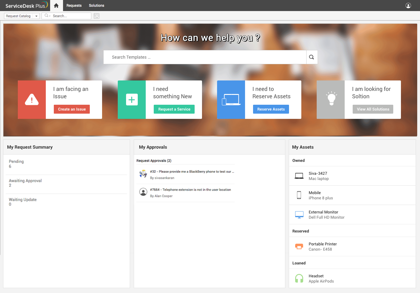
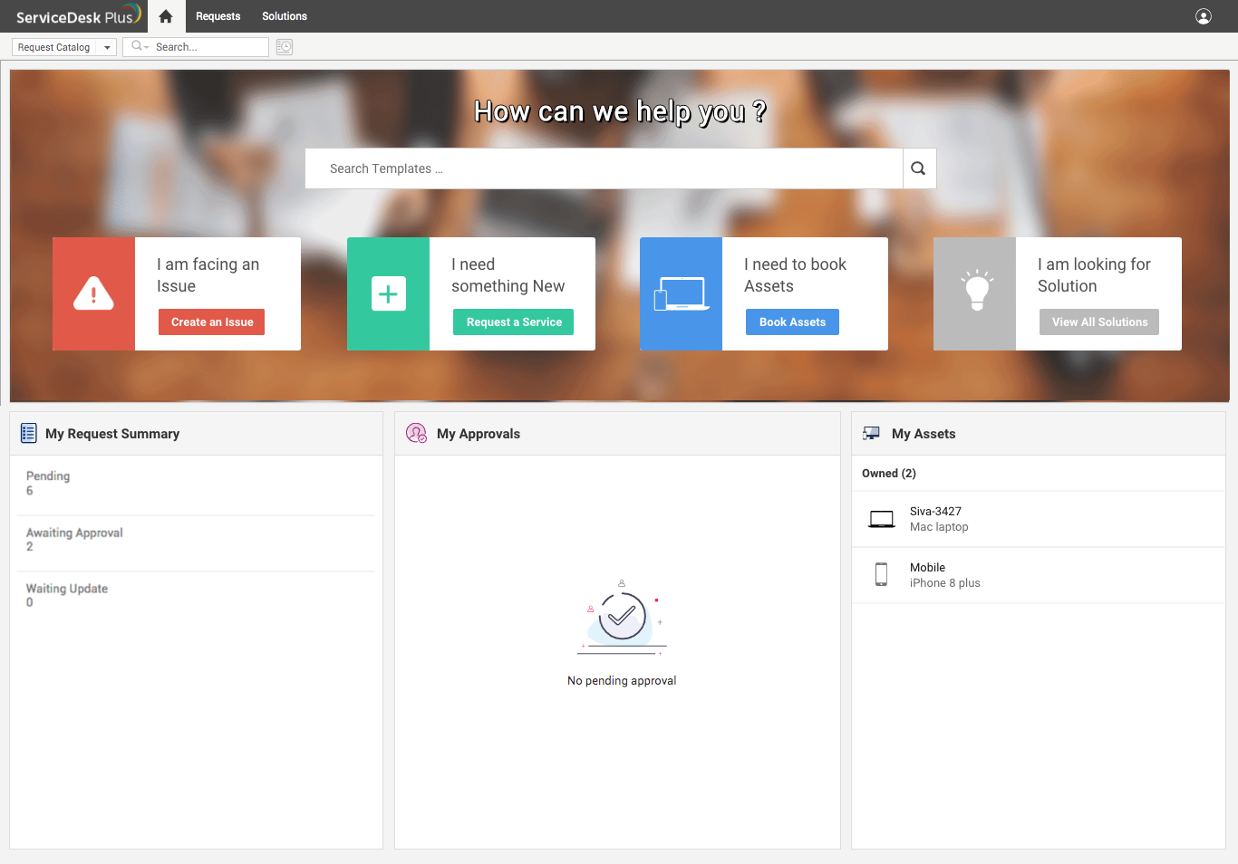
The designs brought reservation into the request home and separated owned, reserved and loaned assets in the personal summary.
What changed
Several labels and treatments were explored as the workflow evolved. The later design made the booking entry and asset state easier to recognise.
Actual evidence: reservation entry and asset state.Actual evidence: a later booking entry direction.
The cleared screens establish the interface direction. I can explain the deeper constraints, collaboration and released scope in a live session.
05 / Service discovery
Service Catalog
Help people recognise the right service among many choices.
Available to showcase during a live sessionOriginal project artefact. Select an image to inspect it at full size.
The problem
A large catalog can make the next request hard to recognise. Categories, descriptions and search must support both browsing and scanning.
What I did
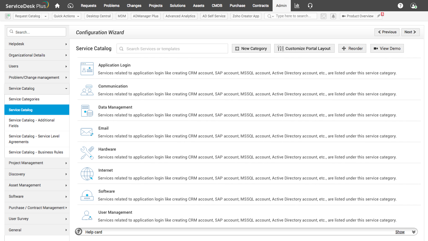
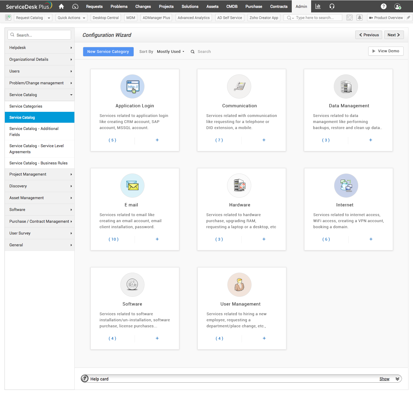
The designs explored category cards with descriptions and counts, followed by a more compact list and search presentation.
What changed
The work made the tradeoff between visual browsing and dense scanning explicit, allowing the interface to evolve with the size of the catalog.
Actual evidence: category cards, descriptions and counts.Actual evidence: the later list and search presentation.
The images show the shift in presentation. Measured search speed is not claimed; the decision context is available for a live walkthrough.
Live interview walkthrough
More context during an interview.
The public portfolio focuses on the problem, the design response and cleared evidence. In a live session, I can add organisational context, collaboration, tradeoffs and released scope.